MetroHealth Glick Center Transforms Care In Cleveland
This article was originally published on March 22, 2023, and is among Healthcare Design’s most-read articles of 2023. To see a full list, click here.
MetroHealth Glick Center
In 2011, The MetroHealth System in Cleveland conducted a facility condition assessment of its safety-net hospital buildings, ranging in age between 50 and 90 years, to determine the best path forward.
“The answer from a dollars and cents standpoint did in fact show that it was far more practical to rebuild than to try and renovate,” says Walter Jones, senior vice president of campus transformation at MetroHealth.
However, a replacement project didn’t immediately receive the leadership buy-in required to set the funding wheels in motion for the public hospital—that is, until the winter of 2013/2014. An arctic blast hit the city on Lake Erie, causing MetroHealth to consider evacuating the hospital on two occasions, Jones says.
“The infrastructure of the existing facilities demonstrated that it was incapable of providing ongoing, continuous, reliable support for the foreseeable future. It nearly failed during that winter event,” he says. “That became a clear definition of the condition of the facility, probably in no way a report could ever do.”
And so the process began. In May 2014, the organization announced its mission to transform the hospital into a modern care setting capable of serving a long-term future. That move also inspired the 2014 hiring of Jones, putting him in place to lead the charge.
However, he says today, the original vision of what essentially was to be “a simple replacement hospital” soon broadened. “‘Transformation’ took on more in terms of its definition than originally conceived of,” he says.
MetroHealth’s impact on community
MetroHealth is an anchor institution in the city, nestled into a westside community that’s one of the most economically challenged and diverse areas in Cleveland. Hospital leadership soon realized the potential ripple effect that a project of this size might have, both the new hospital and an overall campus redevelopment.
“It put a $1 billion pin in this section of the community that had not had this level of investment in it before,” Jones say. “The value of what that could do community-wide started to permeate into considerations about what this transformation could mean. We became a developmental leader in the neighborhood.”
MetroHealth embraced that role, too, and began bonding with other community groups in its planning. Efforts included creating a new rapid-transit bus line that expanded service and frequency to the main campus and other health centers; launching, in partnership with the Cleveland school district, a science and health-centered high school located inside the hospital; and building an affordable-housing apartment complex on-site for qualifying members of the community.
In fact, the project became the catalyst for extensive organizational change, Jones says, particularly in MetroHealth’s shift from a hospital to health-and-wellness mindset. “It was truly transformational in every sense of the word,” he says.
(For more on MetroHealth, see “MetroHealth Cleveland Heights Behavioral Health Hospital: Photo Tour.”)
Planning a new urban hospital
That mindset informed the vision for the hospital itself, as well. The existing facility was an amalgamation of spaces added on over the years as volumes and care needs dictated, a fact that ultimately eroded the overall experience.
And while those drivers still had to inspire the replacement—particularly supporting key service lines like a Level 1 trauma center and burn unit—the project also brought the opportunity to rethink how care is delivered, Jones says.
“We need to make sure we can respect our patients and families while we’re delivering care and provide adequate space for other supporting efforts that they need,” he says.
Additionally, leadership eyed flexibility and adaptability as key, viewing the project as an opportunity to ensure the new hospital has the longest lifespan possible and that decisions made at the onset weren’t outdated upon completion.
Choosing the hospital project team
This lengthy planning process also meant that when it was time to choose a project team, potential partners were handed a fairly complete package to review, with both program and cost models. As a public institution, MetroHealth had to conduct a competitive bid process. But it chose to go further than the minimum required due to the large-scale, high-profile nature of the project, Jones says. It used multiple interview phases to determine which firms best rose to the challenge.
There was an added curveball, too: the desire to achieve ultimate flexibility and adaptability had led Jones to the concept of “process neutral.” Essentially, the goal being to achieve spaces that are so universal that the hospital could use them for almost anything and shift space assignments based on volume and care needs as frequently as desired.
What that meant for planning and design, though, is that user group meetings weren’t necessary to the traditional extent. Instead, MetroHealth would rely on its users for tactical, specific information. The expertise of its architects would be used to help determine space requirements to achieve the adaptability desired.
Mark Bultman, healthcare market sector leader at HGA (Milwaukee), says his team responded to the challenge by bringing an evidence-based approach to the interview process, using the firm’s experience to, at times, even challenge what had been planned to that point.
“In our interview, we respectfully used evidence to ask questions about what might be done differently in regard to patient experience, operations, and building performance,” he says.
For example, HGA pushed back on an original plan for two 30-bed patient units per floor. Instead, they showed how two 24-bed units per floor were more efficient for staff while a universal platform would support flexing up to 48 beds, if needed.
In the end, HGA was brought on board to lead planning, architecture, interior design, and engineering, with Bultman as project principal. HGA was joined by Bostwick Design Partnership (Cleveland) as the associate architect and Turner Construction Co. (Cleveland) as construction manager at risk.
Although not a formal IPD project, the team worked together in a “transformation center,” or big room, for four years of deep collaboration that achieved the December 2022 opening of the MetroHealth Glick Center. The project comprises a new 11-story, 312-bed hospital as well as renovation of existing space for women’s and children’s care.
Creating a community-forward healthcare campus
As MetroHealth set out to create its community-forward campus, that effort ultimately led to a full rebranding of the organization. It also inspired numerous design elements along the way.
Bultman says that as HGA began researching the surrounding neighborhood, it found that as MetroHealth had undergone all those expansions over the years, residents felt it effectively turned a physical back to them. Now, it was time to correct course and reopen the campus to neighbors.
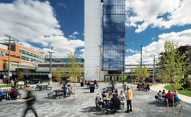
To do so, the new tower is sited so its front door faces the largely residential area around it. Additionally, a “hospital in a park” theme was established that guided a landscape plan. That plan includes a large green space that will further tie the campus to its community and improve the availability of parkland to the urban setting upon the park’s completion in 2024, once the existing hospital is demolished.
“There was one acre of green space on that campus. By the time we’re done, it will be 25,” Bultman says.
Hospital façade design makes new ‘first impression’
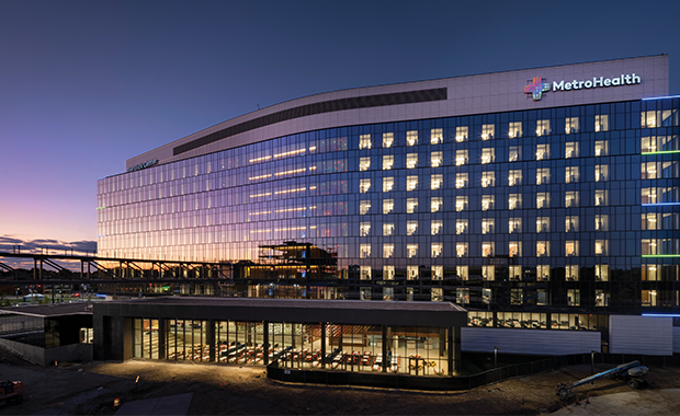
Meanwhile, the exterior architecture was influenced by what’s known as the “MetroHealth curve,” a bend in a local expressway where the campus prominently sits as a distinct point on the city skyline. The existing double cylindrical patient towers loom over the thoroughfare, a structure Jones admits he thought was a prison on his first visit to Cleveland.
And shifting that first impression became a driving force for the team—especially for Bostwick Design’s Mike Zambo, principal. He says as a lifelong Clevelander he was determined to communicate the iconic nature of the site.
“It was an extremely important building, and I thought it was our responsibility as the local [architect] to share that with HGA so they didn’t put in the same solution as any other site. And, clearly, they were able to do that,” he says.
The new building provides a subtle curve that follows the line of the highway in a curtain wall of high-performance glass that elevates the overall look and feel from afar to both establish the MetroHealth presence and feel welcoming, says Bryce Hubertz, senior project designer with HGA.
The building is then sited so its 800,000 square feet don’t feel so overwhelming from the pedestrian level, with a more slender face extending toward the neighborhood. The building is then clad in white terracotta panels. A texture at the base inspired by nearby bodies of water, Lake Erie and the Cuyahoga River, results in a subtle wave form that fades to a flat panel as it extends up the tower.
Colorful interior design
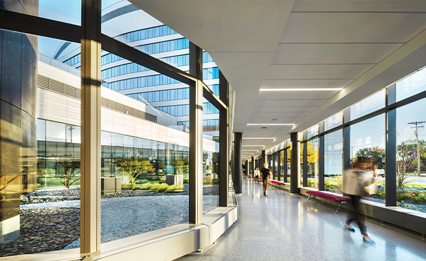
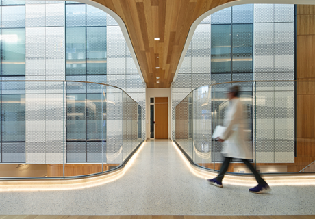
The design team next set out to ensure visitors felt as welcome inside as out. First, an onstage/offstage circulation was adopted to ease navigation, with a public main street on the perimeter. This enclosed, windowed walkway essentially spans the campus (from the main entry to the existing emergency department to the in-progress outpatient building and garage) with views to the park all along the way.
“You can never get lost. You always have that park as a reference point,” Hubertz says.
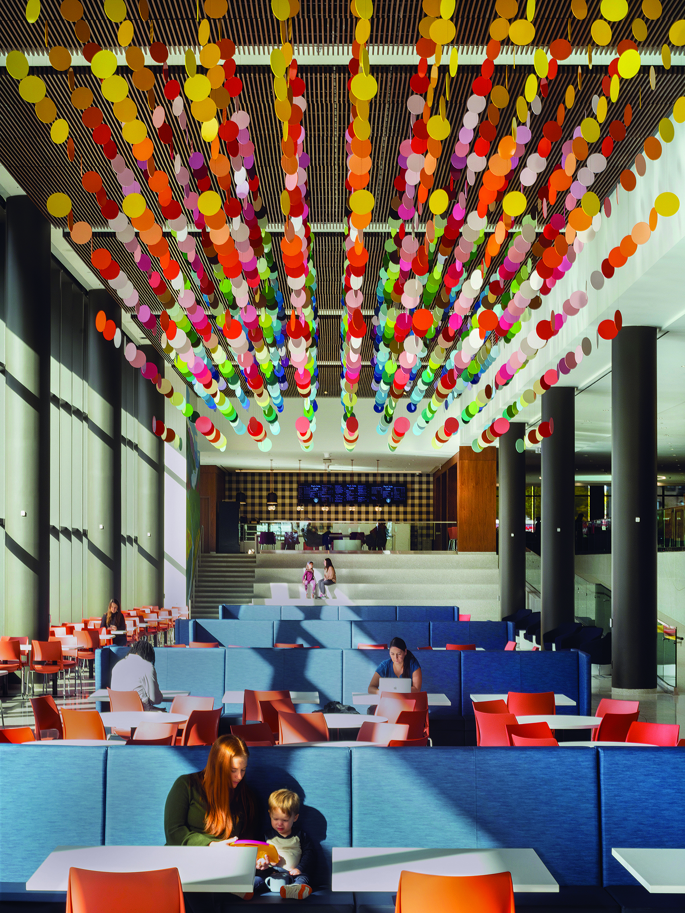
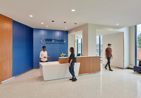
The hallmark of the first-floor public space of the Glick Center is a double-height lobby with 300-seat dining room that offers space for patients, staff, and community members to grab a coffee or bite to eat or even check out an art performance. The space also introduces the facility’s overall interiors palette that’s anchored by a deep blue complemented by a range of jewel tones.
“As much as the exterior is a huge transformation, in comparison to the main lobby that existed previously and the new, it’s a huge transformation—the amount of color, the space, the daylight,” says Kate Bautista, associate vice president at HGA and lead interior designer on the project.
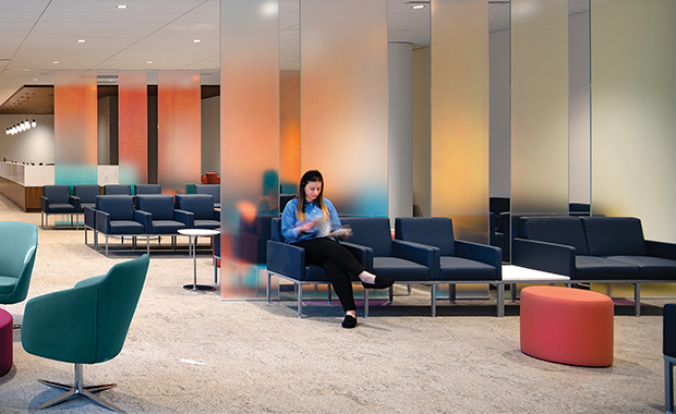
The colors, specifically, were inspired by the numerous public art murals in the surrounding neighborhood, Bautista says. Beyond finishes and furnishings, the palette is even found in dichroic glass used throughout the building.
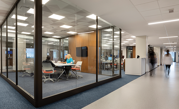
For example, the glass is used for walls of staff meeting spaces on each patient floor and as dividers within waiting spaces to bring a dynamic, colorful experience. Fortuitously, the palette selected by the design team is almost a match to colors found in MetroHealth’s new logo and branding created independently of the building project, with that design team inspired by the community’s colors exactly as the Glick Center team had been.
“We have a little microcosm of color from what is present in the neighborhood permeating throughout the hospital,” Jones says.
Integrating art at Metrohealth
Art plays a key role within the campus transformation, as well, with community once again guiding the way. Linda Jackson is director of MetroHealth’s Center for Arts in Health, which integrates the visual, performing, and therapeutic arts throughout the organization’s hospitals and clinics as well as schools and neighborhoods. She says her group was created years before the project team was assembled to ensure the arts would be integrated within the new hospital program.
The art team used the guiding themes of “hope, healing, and community” from their purpose statement in the selection of pieces. It also committed to achieving diversity within the arts to ensure anyone who entered the building would feel welcome, “that people would see themselves here and their stories and have shared experiences,” she says.
To that end, MetroHealth partnered with art consultant Land Studio (Cleveland) to select each piece of the 1,008-piece collection. The collection includes 695 unique works of art (15 pieces are repeated in the patient rooms), the majority of which (74 percent) are by local artists or artists with a local connection, Jackson says.
And thanks to the early integration of her team and partnership with HGA, the art pairs cohesively with the design. Jackson attributes this to the center’s ability to intentionally commission pieces that achieve the project’s collective vision.
“It was amazing to see how that brought the building to life and made it even more of the community than we could do through the architecture,” HGA’s Bultman adds. “The marriage of those two things, the holistic nature of the building and the artwork, and the choices made putting the art in there, just made the project many times better.”
Using prefabrication for hospital construction
The Glick Center is primed for the future thanks to its intense flexibility, but the team also took advantage of design and construction innovations of today to streamline the delivery. In fact, Chuck Kostrab, vice president and operations manager for Turner Construction, says the building itself was more “assembled” than “constructed.”
For example, the team worked to identify which building elements could be prefabricated and preassembled, such as all of the patient room headwalls and the exterior building cladding. Additionally, 86 miles of piping was unitized, welded, and prepared off-site.
The IPD-like collaboration and big room environment also gave the team the ability to constantly make adjustments to the project as necessary, Kostrab says. What supported that on-the-fly decision-making was a dedicated virtual reality room within the transformation center that allowed the team to virtually walk through renderings to validate both designs and cost estimates.
“That was a huge eye opener and allowed us to make sure we’re providing cost certainty based on the design intent,” Kostrab says. Virtual reality was used for user group meetings, as well, interior designer Bautista adds, saying it permitted staff members to help the team determine where to orient walls or which are solid or glass to promote visibility and sight lines.
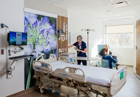
Patient floors 3-9 are identical, each housing the two 24-room units with staff work cores that are 100 percent adaptable thanks to modular furniture, demountable walls, and a grid of outlets in the floors, Bautista says.
“That was quite the challenge—it became a question of grid sizes, how much flexibility do you want?” she says. The team assessed the high cost of placing a grid of outlets at a very high density versus them being so far apart it wouldn’t be of value. “We landed somewhere in the middle where we tried to think about all of the scenarios and do our best to accommodate a future that is unknown.”
Delivering a process-neutral approach at MetroHealth
The unknowns of the future are precisely what spurred Jones’ process-neutral approach overall and the goal to deliver a building that’s an open box with few spaces designed for a specific department or task.
By relying on HGA’s expertise regarding best practices in hospital design as opposed to those of building users, it avoids an inevitable hurtle that most large projects face: Half of staff members initially consulted in the design process are no longer with the organization at the conclusion of the project or provide insight on or requests for solutions that inevitably become outdated.
The result is a building designed specifically for functions described 10 years prior and that don’t apply anymore, Jones says.
Instead, staff were consulted for specifics, such as the need to provide laboring tubs in labor and delivery rooms and other unique space requirements for specialized spaces. “If we make the environment as adaptable as we can, then we don’t need to worry about asking the question, ‘How are you going to do what you’re going to do?’” he says.
Bultman says the directive caused HGA to pause and reconsider how the firm had traditionally approached design, particularly its mission to create spaces that support the most efficient, Lean operations possible—essentially, to design space to support specific processes.
“Walter’s idea of ‘well, wait a minute, that might be backwards’ was really industry challenging,” he says. “The problem with [Lean] is that five years later when you change how you want to do something, now the space isn’t very flexible.”
Building inpatient units
Where process-neutral is most evident in the Glick Center is in the inpatient units and interventional platform. The 85-room interventional platform is entirely universal across prep and recovery so that as services shift or volumes go up or down, the platform can flex, Bultman says.
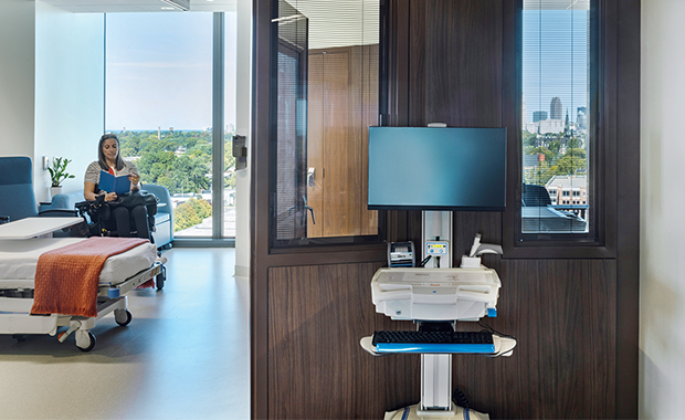
On the inpatient units, all rooms are universal medical/surgical ICU rooms that can change use over time, even day to day. All rooms are single patient but a portion house the necessary infrastructure to flex up to two patients in surge scenarios and all include dialysis equipment to perform treatments in the patient room.
The individual units connect seamlessly backstage allowing staff to easily reassign rooms based on census variations. Meanwhile, in the imaging department, the blocks of space for both MRI and CT rooms are identical.
For even greater flexibility, shell space was built in that can become an MRI or a CT room so that as needs change, rooms can support either use and it’s only a matter of equipment needs that must be considered. Additionally, the building is designed so that it can easily switch one-half of the tower to negative pressure in the event of a future pandemic.
Maximizing flexible healthcare design
The building is so neutral that space allocations per floor and unit didn’t have to be decided at the outset, with the exception of specialty spaces. “But for the rest of the platform and tower, it didn’t matter,” Jones says. “No choice had been made until late in the project. That’s a prime example of the benefit of the design.”
In fact, a two-story expansion to the adjacent critical care pavilion was completed in 2016, with a universal design for ICUs that informed that of the Glick Center. As part of this new project, that ICU addition was reprogrammed to support women’s and children’s care and required only minimal changes.
“To be able to say it was an ICU yesterday and it’s going to be a postpartum room or a private NICU room tomorrow was exactly what we were talking about. You can occupy it with whatever patient you want in there,” Jones says.
And while universal design isn’t new to healthcare, Jones says too often owners will shy away from truly achieving it thanks to the “extra stuff” that must be integrated into every room, from additional square footage to med gasses.
But as he sees it, care trends, acuity levels, and patient volumes are unpredictable over a course of even just 10 years, let alone the life of a facility. “Why do you want to build a building and spend this kind of money at the cost per square foot you’re building it to confine yourself to the same constriction you have in your existing hospital?” Jones says. COVID-19, he adds, only solidified his belief. “You really can’t predict the future.”
The Glick Center is bearing that out even now, opening in the midst of a triple-demic of COVID-19, flu, and RSV and immediately full. “Who knew? But we’re able to accommodate it,” Jones says.
Transformational hospital project
Jones’ tenure with MetroHealth will end now that the transformation has come to a close, but not before he’s had the chance to see patients, visitors, staff, and the larger community experience what was achieved.
He’s taken to sitting in the lobby dining area, watching people fill the space and react to the stark difference between old and new. “The most common word I hear is how ‘beautiful’ the space is,” he says.
Jones’ hope is that HCAHPS scores will capture the importance of the environmental change and that a future post-occupancy evaluation will be conducted, as well. In the meantime, though, his anecdotal observations show a community embracing a project that was truly built to serve them.
“So far it’s been really successful in terms of what we wanted to provide as the impression of the hospital for our patients and visitors coming in,” he says.
Jennifer Kovacs Silvis is editor-in-chief of Healthcare Design. She can be reached at jennifer.silvis@emeraldx.com.
Project details for MetroHealth Glick Center
Completion date: October 2022
Owner: MetroHealth System
Total building area: 800,000 sq. ft.
Total construction cost: $535 million (patient tower only; $945 million includes soft costs, women’s and children’s renovation, hospital demolition, and site work)
Cost/sq. ft.: $840
Architecture: HGA (architect of record and design architect), Bostwick Design (associate architect), Makovich & Pusti Architects Inc. (local architecture support)
Interior design: HGA
Engineering: HGA (mechanical, electrical, civil, structural), Karpinski Engineering (associate MEP engineer), Sandhu & Associates (plumbing), EMH&T (civil), Osborn Engineering (civil)
Construction: Turner Construction
Landscape architecture: HGA, Behnke Landscape Architecture
Medical equipment planning: Ross and Baruzzini
Medical planner: HGA
Art/pictures: Land Studio
AV equipment/electronics/software: Shen Milsom & Wilke
Carpet/flooring: Interface, Nora, Forbo
Ceiling/wall systems: Armstrong, Sanfoot Wood Wallcovering
Doors/locks/hardware: D.A. Loss Associates
Fabric/textiles: Carnegie, Ultrafabrics, Mayer
Furniture—seating/casegoods: IOA, Steelcase, Herman Miller, Knoll, Kimball, Paul Brayton, Sit On It, National, KI, Krug, Davis, Bernhardt
Handrails/wall guards: Inpro, Koroseal
Signage/wayfinding: Guide Studio
Surfaces—solid/other: LG Hausys, Difiniti Quartz
Wallcoverings: Xorel, Designtex
Vertical transportation: Lerch Bates
Food service: Rippe Associates
Environ assessment: SLR Consulting
Project details are provided by the design team and are not vetted by Healthcare Design.

