CHOP’s New Hospital Creates Full Spectrum Of Care In King of Prussia, Pa.
Children’s Hospital of Philadelphia (CHOP) opened the first dedicated pediatric hospital in the country nearly 170 years ago. Since then, it has expanded its network with primary, urgent, and specialty care centers but never pursued a second inpatient facility.
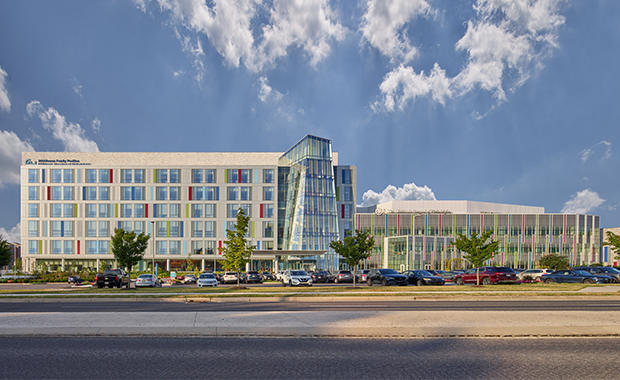
Not until 2022, when CHOP opened the Middleman Family Pavilion in King of Prussia, Pa., about a half-hour’s drive from the organization’s main Philadelphia campus.
“We saw a need to provide additional services for patients by offering a full spectrum of pediatric care in this community,” says Cheryl Gebeline-Myers, associate vice president of operations at The Middleman Family Pavilion.
CHOP already had a longstanding presence in King of Prussia, thanks to a Specialty Care Center opened there more than two decades ago. Recognizing the area’s growth potential, CHOP invested in a larger piece of property about 10 years ago, where it moved the outpatient center. The new location provided access to several major highways and room to expand its offerings, adding ambulatory surgery and urgent care services.
When the organization realized that many patients were traveling from this northwestern region to access inpatient care at the main Philadelphia campus, CHOP saw an opportunity to further augment its services in King of Prussia by opening a 272,000-square-foot hospital adjacent to the outpatient facility.
“It made sense for us to add inpatient services next to our Specialty Care Center, because not only did we have the space to accommodate it, but there were so many synergies for the continuum of care,” says Natalie Miovski Hagerty, senior director of facilities planning, design and integration at CHOP. “It allows our patients and their families ease of access without having to drive farther to get to our Philadelphia campus.”
Strategic connections between inpatient and outpatient facilities
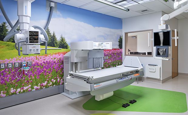
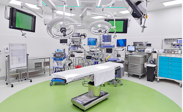
Opened in January 2022, The Middleman Family Pavilion has 52 inpatient beds and a 20-bay emergency department in addition to imaging services and a surgical suite equipped for specialty operations. To maximize the continuum of care, the new facility had to seamlessly integrate with CHOP’s existing outpatient center, both functionally and architecturally.
“The existing building was a linear building, and the available site lent itself to a linear expansion of that—like two train cars locked together,” says Terry D. Steelman, senior principal and director of design at Ballinger (Philadelphia), which served as architect, interior designer, and MEP and structural engineer on the project. “We had to determine the location at which these two buildings would strategically connect.”
The services in the existing three-story outpatient facility influenced the organization of the new hospital’s first three levels, which all connect. Because many patients and providers move back and forth between the two facilities, Ballinger aimed to streamline the traffic flow by leveraging adjacencies between buildings.
A significant grade change on the site places the main hospital entry about 20 feet higher than the opposite side of the building. The urgent care facilities were located on the lower side of the existing outpatient building, Steelman explains, so it made sense to place the ED on the lower side as well, permitting patients to access either service through the same entrance.
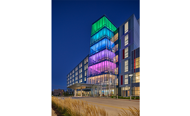
“All the traffic associated with the emergency room is focused away from the main entrance with dedicated parking,” Steelman says. “This allowed the front of the building to stay entry-focused, so the first floor became an arrival platform for the whole complex.
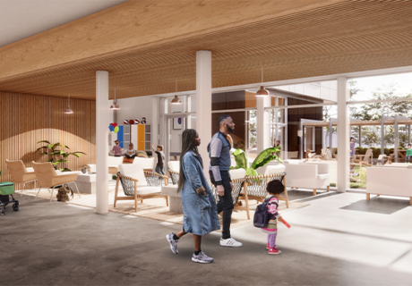
“We consolidated the entrances for both buildings into one common lobby with the waiting area, café, and food service. The intent was that everybody came in the same door, whether they were outpatient or inpatient.”
Building layout
These shared entry points are key to creating a smooth continuum of care between inpatient and outpatient services by reducing reception redundancies for staff and providing a central check-in point for patients.
“Regardless of whether they’re going for specialty care or surgery, they’re going to encounter the same welcoming staff at the front desk and the same providers,” says Gebeline-Myers. “That sort of consistency, in the eyes of a 4-year-old who’s a little nervous to go for healthcare services, matters an awful lot.”
The second floor houses critical care, the pharmacy, and a testing laboratory.
“That worked out to be a beautiful connection because we also have our oncology services on the second floor of the Specialty Care Center,” Hagerty says. “By having the pharmacy on the second floor, we’re able to not only support the ICU with its higher medication needs, but we also have a direct connection for chemotherapy on the specialty care side.”
Surgical services are strategically located on the third floor of the hospital, expanding the existing ambulatory surgery center so staff and supplies can efficiently move between facilities. Above that, floors four, five, and six are dedicated to inpatient beds, with shell space on some of the floors to accommodate future growth.
In fact, since opening in January 2022 with 52 beds—including 36 medical/surgical beds and 16 critical care beds—the new facility will end 2023 with 108 beds, nearly half of which will be critical-care capable. Additionally, eight new ED treatment bays are currently under construction in shell space on the ground floor.
“We wanted to make sure that if there was something we missed or we needed to pivot, we would have the space to do that,” Hagerty says. “We also knew that we were going to grow, so having that shell space was critical.”
Bold interior design strategy
Besides integrating with the existing building, CHOP posited another design challenge to Ballinger: to make the new inpatient facility age-appropriate for all of its patients.
“When most people think of children’s hospitals, they tend to think of kids between the ages of three and seven,” Hagerty says. “But our patient population ranges from newborns all the way up to 20-year-olds, and I don’t know any teenager who’s excited to go into a place themed for a 5-year-old. So, one of our big design challenges is that we want to create a place that’s joyful and uplifting but not childish.”
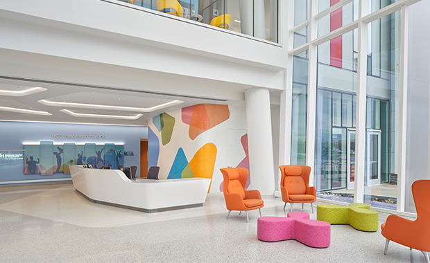
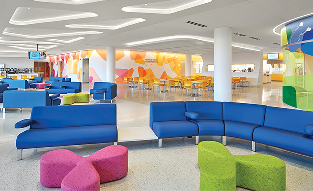
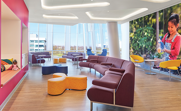
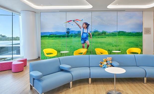
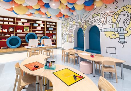
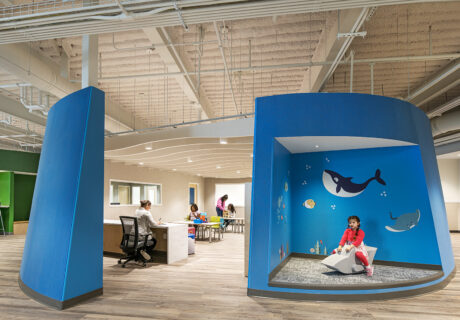
To strike this balance, Ballinger used an underlying palette of soft white to make the interior feel spacious and sophisticated, and then added bold pops of color and kid-centric artwork.
“Part of that was motivated by the fact that we didn’t have a lot of spatial volume,” Steelman says, “so to make it more open and brighter, we used a very light palette.”
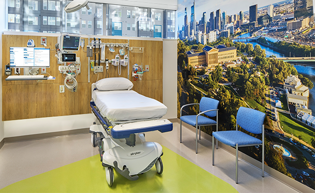
Bold accents keep the white space from feeling too clinical, with abstract forms of color on the walls and matching modern furnishings that offer intriguing focal points throughout the lobby. Stylized photomurals feature kids playing outside, spanning a diversity of ages, ethnicities, and abilities, including children in wheelchairs.
“It was important that the kids could see someone like themselves in these environments,” Hagerty says, “because the whole idea was to make kids feel more comfortable.”
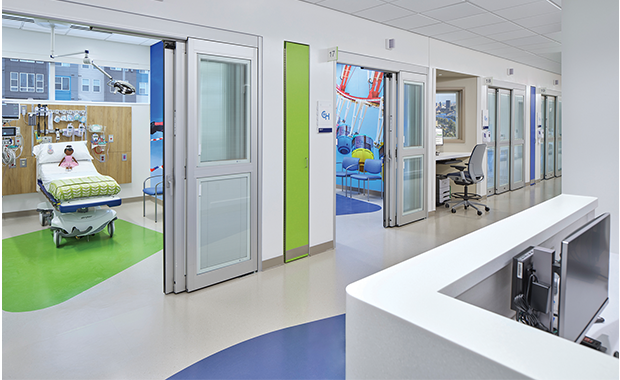
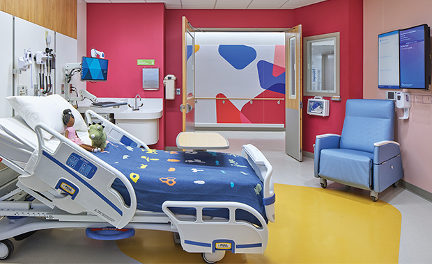
The vibrant color schemes and place-based graphics continue in the patient rooms, which are all single-occupancy rooms to provide privacy. Large windows allow plenty of natural light and create scenic backdrops for patients and their families.
“The goal was to create a joyful environment, recognizing that these kids are not naturally joyful if they’re in the hospital,” Steelman says.
Collaborative design process
The Middleman Family Pavilion gave CHOP its first chance to reimagine inpatient care outside of Philadelphia, from both design and operational perspectives.
“We weren’t looking for an exact replica of our Philadelphia campus,” Gebeline-Myers says. “We knew this presented an opportunity to think about design in a different way to meet the needs of a smaller-scale operation, so we tapped into everybody at this enterprise to share what they thought was important.”
For example, the laboratory benches in CHOP’s high-volume Philadelphia campus are highly specialized because each technologist typically focuses on one testing modality. But to accommodate the testing scale of the laboratory in The Middleman Family Pavilion, CHOP wanted “a generalist support model,” Gebeline-Myers says.
“This means that all of the lab techs are trained on all the benches. That cross-training allows those team members to deliver the same excellent services but in a more efficient and flexible way, which is necessary for this campus,” she adds.
To create a space conducive to these efficiencies, CHOP and Ballinger relied on a multidisciplinary team to inform the design process, which kicked off in November 2017. Feedback from the hospital facilities team, nurses, doctors, and operations staff ensured that design decisions made sense to people who would actually be using the facility.
This collaboration also extended to family and youth advisory councils that were engaged in the design process, providing direct feedback that helped shape the project.
After seeing a mock-up of a patient bathroom, for example, one youth advisor asked where to put his toothbrush—prompting the addition of a small, stainless-steel shelf over the sink.
Gathering lessons, feedback
Feedback from families has been so positive that many of the project’s collaborative design decisions are starting to trickle into other projects.
For example, elements of The Middleman Family Pavilion, such as the color palettes and playful aesthetics, will be leveraged in a new 1.4 million-square-foot inpatient tower that Ballinger is designing at CHOP’s Philadelphia campus, slated to open by 2028.
“We’re learning what works well from King of Prussia,” Hagerty says. “In fact, we’re doing a post-occupancy evaluation right now, because we want to make sure we capture all the lessons and apply them to future projects.”
Brooke Bilyj is a freelance writer and owner of Bantamedia in Cleveland. She can be reached at brooke@bantamedia.com.
Project details for Children’s Hospital of Philadelphia, Middleman Family Pavilion
Project location: King of Prussia, Pa.
Project completion date: January 2022
Owner: Children’s Hospital of Philadelphia
Total building area: 250,000 sq. ft.
Total construction cost: confidential
Cost/sq. ft.: confidential
Architecture: Ballinger
Interior design: Ballinger
MEP Engineering: Ballinger
Structural Engineering: Ballinger
Construction Manager: Skanska
Civil Engineering: Bohler Engineering
Landscape Architects: Ground Reconsidered
Sustainability: Re:Vision
Environmental Graphics, Wayfinding, and Artwork: Metcalfe Architecture & Design
Lighting Design: The Lighting Practice
Life Safety: Jensen Hughes
Low Voltage & Security: C Archer and Associates
Medical Equipment Planning: FCA
Materials Management and Pneumatic Tube: Lerch Bates
Specifications: Conspectus
Vertical Transportation: Persohn Hahn
Parking: Walker Consultants
Art/pictures: Metcalfe Architecture & Design
Carpet/flooring: Interface Carpet Tile, Nora Rubber Tile and Sheet, Tarkett Luxury Vinyl Planks, Roman Mosaic Terrazzo
Ceiling/wall systems: Armstrong
Doors/locks/hardware: Securitron, Stanley Best, LCN, Pemko, Rockwood, Von Duprin
Fabric/textiles: DesignTex, Maharam, Momentum, Carnegie Xorel,
Furniture—seating/casegoods: Steelcase, Davis, Leland, Carolina, Fritz Hansen, Coalesse, Krug, IOA, Wieland, Nevens, Spec, Bernhardt / Steelcase Answer
Handrails/wall guards: Inpro
Headwalls/booms: Hospital Systems, Inc.
Lighting: Mark Architectural Lighting, Focal Point, Lumenwerx, Gotham, Kurtzon, Poulsen, Lithonia, Inter-Lux, Kenall, Acolyte, Iota, Lumenpulse
Signage/wayfinding: Metcalfe Architecture & Design
Surfaces—solid/other: Wilsonart Plastic Laminate, Corian, Pental Quartz
Wallcoverings: Koroseal
Other: Mechoshade
Project details are provided by the design team and not vetted by Healthcare Design.

