Children’s Hospital of Philadelphia Creates Safe Haven For Behavioral Health Patients
Several years ago, Children’s Hospital of Philadelphia (CHOP) noticed an increasing number of patients seeking medical treatment who also had behavioral health conditions, such as children exhibiting suicidal or other self-harm tendencies or who fall on the autism spectrum.
To address these comorbidities, modifications were made to the 546-bed hospital, such as adding antiligature and other safety features to patient rooms and training more staff to handle kids in crisis.
It was a step in the right direction, but it didn’t answer the fact that patients were often scattered throughout the hospital, with staff and equipment brought to them on an as-needed basis.
“We were attempting to provide high-quality behavioral health support, essentially throughout the entire enterprise, and that created some significant challenges for doing that as well as we would have liked, and as consistently,” says Doug Carney, senior vice president of facilities at CHOP.
Additionally, without an inpatient unit dedicated to the specific needs of such patients, behavioral health treatments often had to be delayed until they were released from the hospital, says Natalie Miovski Hagerty, director of facilities planning at CHOP.
“We needed to be able to look at our kids more holistically,” she says. “Yes, we’re a medical hospital, but we should be able to maintain and, if possible, help improve the underlying behavioral health concern while they’re here.”
For example, if a child was admitted after overdosing, CHOP was equipped to handle the medical issues, but didn’t have the resources to address the cause of the behavior. “This new unit will help us dive into why you did this and help put the child and the family on a better path to move forward,” Hagerty says.
Creating a medical behavioral unit from scratch
CHOP decided the best approach would be to collocate these patients and staff in a designated unit that would support their medical needs and have the necessary safety features to reduce anxiety and stress. Moving from project concept to opening was not an easy process, however.
In fall 2015, CHOP physicians and clinicians and designers from ZGF Architects (Portland, Ore.) began an extensive benchmarking process, quickly realizing that although solutions were in place at other facilities, what they wanted to create—a medical behavioral unit—didn’t exist.
For example, Seattle Children’s Hospital in Seattle has a psychiatry and behavioral medicine unit located adjacent to a medical unit. Other facilities, such as Hasbro Children’s Hospital in Providence, R.I., have psychiatric units where minor medical issues can be managed.
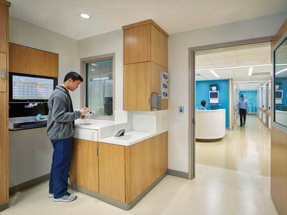
CHOP’s goal, though, was to create a freestanding unit for patients with complex medical conditions that’s equipped with multiple safety features, such as equipment and monitors housed in locked cabinets to prevent access by patients, improved acoustics to reduce noise on the unit, and ligature-free bathrooms.
“We wanted to design it in such a way that you can’t throw a chair or rip things off the walls to make the rooms as safe as possible for these kids,” Hagerty says.
Next, ZGF led a multidisciplinary team, including physicians, nurses, and psychologists, through design charrettes to create six patient avatars that represent the types of patients who will likely use the unit:
- an aggressive patient
- a post-op aggressive patient who might be at risk for pulling out his or her lines or other self-harming activity
- a suicidal patient
- a patient who tries to ingest foreign bodies
- one who’s a flight risk
- and another with acute psychosis.
The process allowed the team to anticipate the needs of these specific patient populations and answer those needs in the design.
Designing for a multidisciplinary care team
In conjunction with the new unit, CHOP wanted to create a new care model that would bring together a multidisciplinary care team, including certain providers, social workers, and therapists, in one spot.
“They could be more instantly available, more physically present, to support these children as they are treated for their medical needs,” Carney says.
CHOP assigned two co-medical directors—a pediatrician and a psychiatrist—to the unit to give equal weight to the medical and behavioral sides of care and involved them in the planning and design process to help guide operations and layout.
With these pieces in place, the team then spent nearly two months prototyping room mock-ups in the hospital basement, starting with building a patient room out of foam core and eventually creating a room to finish level.
Throughout that process, Carney says several hundred staff members, including clinicians and environmental services and facilities staff, were brought through the room to test different features and provide feedback.
The process resulted in modifications such as changing the angle of the staff handwashing sink so nurses could maintain eye contact with patients. Additionally, a new locking mechanism was installed on cabinets that hold medical equipment and monitors to improve speed of access for the staff.
“Without an archetype to follow, the prototype [process] was the only way to get feedback on the design, so we needed time to do that,” Carney says.
CHOP also conducted mock patient events and ran simulation codes—from medical events to a child acting out emotionally—to ensure that all the safety, patient, and staffing needs were being addressed cohesively.
Marla Vanore, RN, director of nursing, trauma, and injury prevention at CHOP, says one of the biggest challenges was finding the right bed, because a medical bed has features, such as multiple long cords, that a child with suicidal tendencies could use to harm themselves, while a behavioral health bed isn’t designed for medical procedures.
“If a child went into cardiac arrest, we needed to be able to quickly drop the head of the bed down, lower the whole bed, and do resuscitation,” she says. Ultimately, the team chose a medical bed that’s customized with fewer and shorter cords.
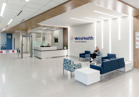
In January 2017, the new 10-bed, 11,000-square-foot medical behavior unit opened on the fourth floor of an existing inpatient tower.
Soothing setting for kids
While the project team didn’t want the emphasis on safety to result in a medical behavioral unit that looked institutional or felt like a psychiatric unit, they also knew it couldn’t look like the other floors in the hospital. (For more on design considerations for pediatric mental health environments, read this Healthcare Design article.)
“Certain colors, flashing items, or imagery could escalate some of the anxieties that these patients might have,” Hagerty says.
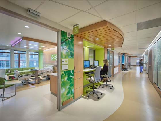
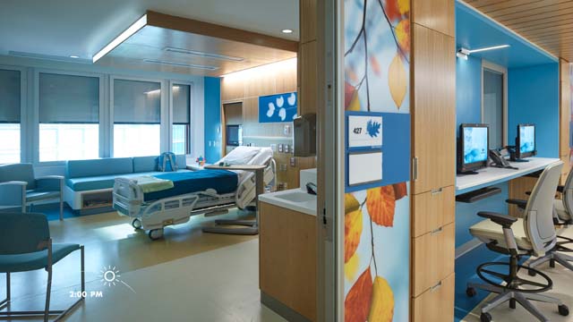
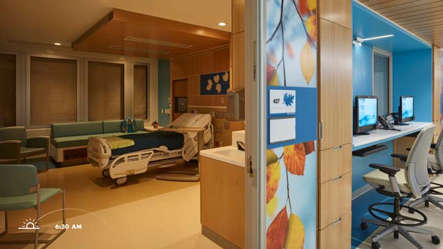
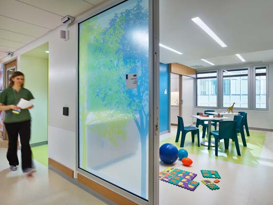
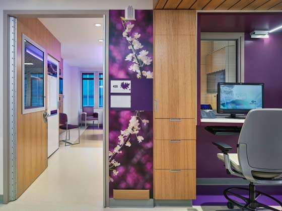
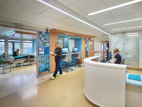
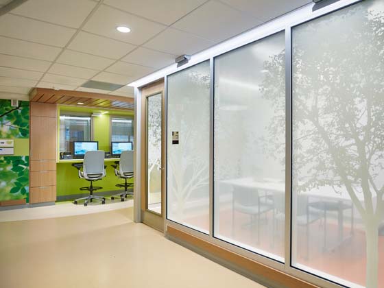
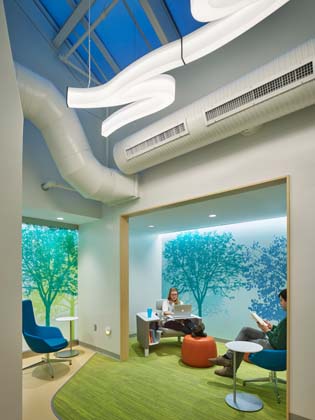
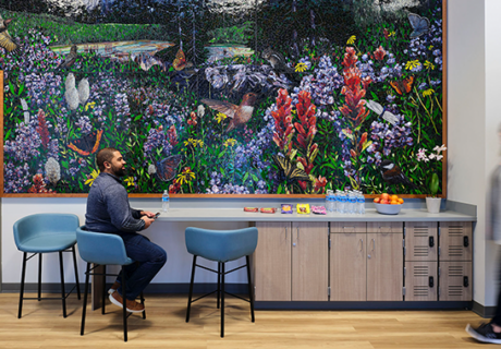
Instead the bold colors schemes and visual activity in other departments have been replaced with a soothing color palette of greens, blues, and lavenders and nature-themed graphics. Supplies, computers, TVs, and equipment are stored in cabinets and out-of-site areas to keep rooms and corridors clutter free.
The team employed evidence-based design to choose design features proven to have a positive effect on the emotional state of patients, says Sue Ann Barton, a principal at ZGF and medical planner on the project.
“We wanted to be proactive and defensive at the same time,” she says. For example, private rooms, small patient neighborhoods, and quiet corridors help promote a calming and welcoming environment that can reduce stress and aggression. Defensive design elements include detailing on casework that prevents patients from accessing equipment; durable material selection, such as rubber flooring and tamper-proof hardware; and ligature-resistant plumbing fixtures.
CHOP’s parent and patient advisory groups consulted on several of the design features, including the importance of giving young patients a sense of control during their hospital stay. Each of the patient rooms has an LED lighting system embedded in the ceiling that allows patients to project different colors onto the footwall, depending on their mood or preference.
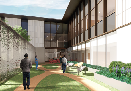
Working within the floorplate of the existing building, the patient rooms are organized along an L-shaped floorplan, with six rooms on one side and four on the other, breaking up the unit into smaller neighborhoods that are easier for patients and family members to navigate.
Each room has a window and private bathroom. Decentralized nurses’ stations are located between pairs of rooms with open care team stations in each neighborhood. Off-stage corridors are used to move supplies, linens, and soiled materials on and off the unit to further reduce traffic and noise in the corridors.
Planners also made room for some amenity spaces that are more common in behavioral health units than a medical inpatient floor, including an activity room, which can be used for dining and group therapy sessions, and two comfort rooms where patients can go to be alone or calm themselves down. “The teams saw it as part of the care model,” Hagerty says. “Kids can cuddle in there by themselves; it’s a safe area.”
A place to thrive
When the work was completed, CHOP decided to start with a four-month soft opening, activating only five of the inpatient beds for patients with comorbidities to give the staff time to refine their processes and learn how to work together (the other beds were used for regular inpatient needs until the unit was fully activated in early April).
While the unit has been in operation less than a year, Vanore says the staff reports that the environment has allowed them to successfully address patients’ dual needs. Another benefit, Carney says, is the sense of community that the unit has created for both staff and patients.
“It gives patients a sense that they’re a part of something and that there are other people experiencing the same thing,” he says. “Even though they may still be very frustrated, that’s comforting.”
CHOP is eager to share lessons from the project, with plans to conduct a post-occupancy evaluation on the project, including studying the unit’s lighting strategy to measure its effect on patient mood and behavior.
“I think there’s a lot to learn about the way the room has been designed, in terms of decluttering it, making it safe, making it supportive and soothing, and in some way giving the patients some element of control over the environment as a form of empowerment,” Carney says.
Anne DiNardo is executive editor at Healthcare Design magazine. She can be reached at anne.dinardo@emeraldx.com.
Sidebar: Lighting strategies for behavioral health environments
Lighting was an important strategy in creating a welcoming, healing environment for patients in Children’s Hospital of Philadelphia’s (CHOP) new medical behavioral unit.
“Exposure to daylight is effective in improving mood and reducing depression, which supports the goal of providing a healing environment that reduces the stress of a hospital stay for patients and families,” says Sue Ann Barton, principal at ZGF and medical planner on the project. “If a kid’s depressed, they’ll just want to stay in their room and keep the lights off and stay in the dark.”
Using evidence-based design strategies, the design team placed windows in all the patient rooms and corridors. A circadian lighting system is programmed to reflect natural light as it changes in color throughout the day to help regulate body clock rhythms and synchronize the sleep and wake cycles for the patients, Barton says.
The design team also took advantage of an existing skylight in the center of the unit by locating activity rooms, the family lounge, and one of the nurses’ stations underneath it.
“The idea is to keep their circadian rhythms in balance,” she says. “When those get out of balance, it can increase depression, so we’re trying to look at [lighting] from a number of different ways.”–Anne DiNardo
Project details for Children’s Hospital of Philadelphia inpatient unit :
Completion date: January 2017
Owner: Children’s Hospital of Philadelphia
Total building area: 11,000 sq. ft.
Total construction cost: NA
Cost/sq. ft.: NA
Architecture: ZGF Architects LLP with Architecture+
Interior design: ZGF Architects LLP
Contracting: LF Driscoll
Engineering: Keast & Hood (structural); Wick Fisher White (MEP); Metcalfe Architecture & Design LLC (signage, wayfinding, and graphics); AKF (lighting); Acentech (acoustics and vibration); C Archer & Associates (low voltage); Corporate Security Services Inc. (security); Healthcare Building Solutions Inc. (medical equipment planning); Jensen Hughes (life-safety/code consulting)
Construction: LF Driscoll
Art/pictures: Metcalfe Architecture & Design LLC
AV equipment/electronics/software: Acentech
Carpet/flooring: Shaw, Interface (carpet tile); Nora (rubber sheet flooring); Johnsonite (wall base); Dex-O-Tex (Epoxy flooring)
Ceiling/wall systems: Armstrong
Doors/locks/hardware: Best Lock Corp. (electric locks); Securitron (magnetic locks); Corbin Russwin (lock sets); LCN and Sargent (closers); PEMKO and Stanley Works (hinges); Rockwood (bolts, latches, and pulls); Von Duprin (exit devices)
Fabric/textiles: Designtex, Enviroleather, Maharam, Architex
Seating: Keilhauer, Steelcase, Coalesse, OFFI, Tenjam, Bernhardt, Arcadia, Allermuir, Stance
Casegoods: Steelcase
Handrails/wall guards: C-S Group
Lighting: Oracle, MaxiLume
Signage/wayfinding: Metcalfe Architecture & Design LLC
Surfaces—solid/other: DuPont Corian
Wallcoverings: PPG (paint), Korographics (wallcoverings)
Window shades: MechoShade

