Winship Cancer Institute at Emory Midtown Embraces New Model For Care
Leaders at Emory Healthcare and Winship Cancer Institute at Emory University (Atlanta) made it clear from the beginning that they had big ambitions for their new building. They told the design team: Give us something “never before seen or imagined.”
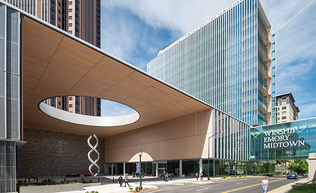
The new facility, occupying 450,000 square feet in Atlanta’s Midtown neighborhood, was designed by Skidmore, Owings & Merrill (SOM; New York) in collaboration with May Architecture (Atlanta)—with input from 200-plus physicians, nurses, janitors, patient family advisers, and more, says SOM Principal Anthony Treu.
“Anybody who could possibly be involved with this project was asked to come and share, ‘How do you do things now? And how do you want to do things differently?’” he says.
Then they dug in deep. “Clinical teams are so adept at working around obstacles on a daily basis that when faced with the chance to create an ideal solution, there’s a natural tendency to default to what’s been working for them,” says Gil May, principal at May Architecture. “It took a minute, but ultimately everyone started shifting from ‘this works’ to ‘this is what we think would be the best solution without constraints.’”
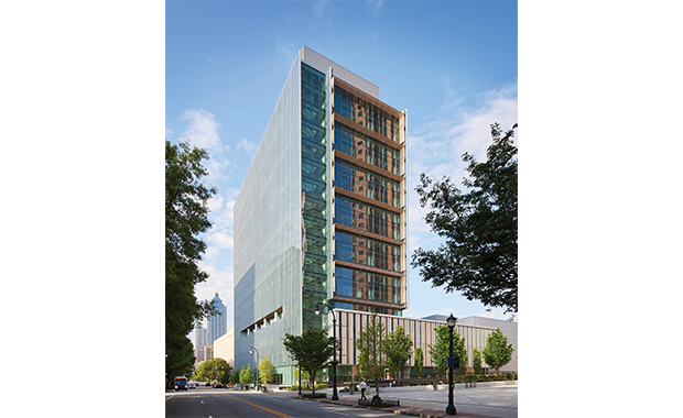
Opened in May 2023, the 17-story facility ultimately embraced a model organized around five “care communities,” each focused on different types of cancer: breast and gynecologic oncology; head and neck tumors; sarcoma and endocrine cancers; genitourinary and gastrointestinal cancers; and lung cancer, lymphoma, and multiple myeloma.
Each care community comprises two floors: the lower floor for outpatient services and the upper for inpatient care. Within those communities, the patient is quite literally at the center of the action.
“Patients remain in a private outpatient suite and as much of their care as possible—including doctors’ appointments, lab draws, infusion treatments, and support services—occur in the suite,” explains Dr. Suresh Ramalingam, executive director of Winship Cancer Institute at Emory University. “We wanted to create the best possible patient experience and an environment that promotes healing.”
Planning approach for a new cancer center
The process of translating the patient-centered cancer care vision into a physical building was helped considerably by cardboard mock-ups of each floor, constructed one by one in a nearby warehouse during the planning stages.
“It wasn’t just a portion of the floor, but the entire floor,” May says. “This allowed the team to spend time in the space to confirm flow, relationships, room sizes, etc. The care teams ran scenarios and exercises that drilled all the way down into details of equipment layouts, millwork, and more.”
The decision to group populations according to cancer types provides benefits to both patients and staff, and it started with the recognition that “cancer” is a big tent: “No one gives you a diagnosis of ‘cancer.’ You get a specific type of diagnosis, which looks different for each patient,” Treu says.
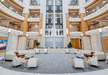
For patients, the care communities, which are connected by two-story communal lobbies, provide an opportunity to interact (as much or as little as they want) with others who can relate specifically to their diagnosis.
For clinicians, it’s a setup that maximizes consultation and coordinated care. “Cancer care often requires multiple types of treatments with specialists from various medical disciplines,” Ramalingam says. “The idea was to design the space to best enable that collaboration.”
Patient-centered design
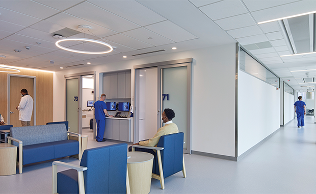
On the outpatient floor of each care community, the patient has a universal room where they’ll be tended by various clinicians during the visit as needed.
In addition to the core disciplines of radiation oncology, radiology, surgery, pathology, hematology and medical oncology, and pharmacy, the room might also support consultations with everyone from dieticians and patient care coordinators to audiologists, genetic counselors, and financial navigators.
Designing a room that could handle all that activity took some careful consideration. “It sounds simple on the surface, but the devil is in the details,” May says. “For example, in a traditional model with an infusion center, the compounding pharmacy is adjacent to the infusion center and the chemo drugs are just walked to the patient. But in a decentralized, universal room approach, how do you get drugs from a central pharmacy to 11 other floors?”
The solution: a dedicated dumbwaiter with controlled access to satellite pharmacy receiving rooms on each floor.
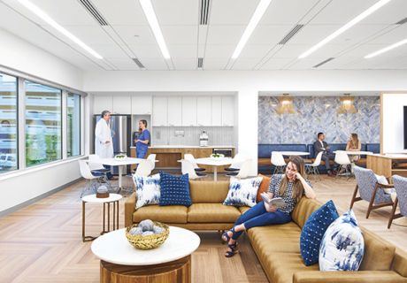
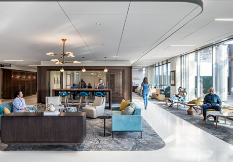
Pods of universal rooms are anchored by common spaces dubbed “living rooms,” where patients and their families can interact if the mood strikes, even during an infusion treatment.
“We learned that one moment an infusion patient may want privacy but the next, that same patient may want to be social,” May says. “This provides the patient with a choice.”
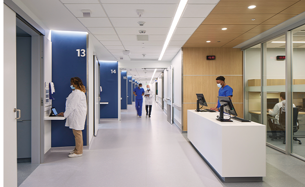
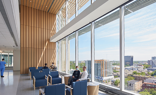
The main corridor for the outpatient units follows the perimeter of each floor along the exterior windows, with the patient and family room groupings on the interior. This set-up resulted in a light-filled suite with daylight for all patients and clear circulation orientation.
Clerestory windows and translucent glass doors in the universal rooms bring daylight into those spaces, as well, without compromising privacy.
Staff considerations
The design of each care community allows for an enhanced experience for both patients and providers. “One of the net results of shifting the corridors to the perimeter was that we could also create an uninterrupted provider zone right down the middle of the cancer center. It creates a connected, collaborative space exclusive to providers, while at the same time a more comfortable and dignified experience for patients,” says Treu.
The uninterrupted caregiver zone provides discreet access to patient spaces along the length of the building. These zones have doors into the living rooms and associated treatment spaces, allowing providers to come and go within these areas unobtrusively.
“It takes the patient side and makes it seem less clinical and allows the provider zone to be more secure and private for the staff,” Treu says. “Patients are shielded from much of the logistics of supplies and samples being moved back and forth. Staff can get to most places in the cancer center without crossing into patient circulation.” The same central-spine thinking was applied to inpatient floors, as well.
Balancing warm aesthetics and modern materials palette
Aesthetically, the design team aimed to balance comfort and familiarity (considering the amount of time patients spend there for recurring visits) with reassurance that the care being provided is high tech and state of the art.
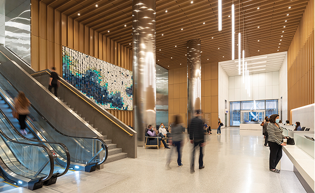
Warm elements that evoke hospitality, including white oak finishes, a subdued color palette, and emphasis on natural light, are thus juxtaposed with “bright, clean, modern, and precise materials with polished metals and glass,” Treu says.
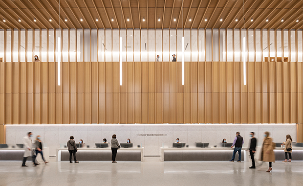
The design team extends the concept of community beyond the center’s walls with a double-height, glass-fronted, street-level lobby, where amenities such as a patient boutique, wellness center, retail pharmacy, and café have been grouped.
“The cancer center is part of this community, and it’s not a place of illness. It’s a place of treatment and health,” Treu says. “We wanted people to be able to see into the building. There is nothing to hide.”
Winship Cancer Institute’s Ramalingam agrees. “We hope that our presence there inspires hope,” he says.
Kristin D. Zeit is a contributing editor for Healthcare Design magazine and can be reached at kristinzeit@gmail.com.
Winship Cancer Institute at Emory Midtown project details
Project: Winship Cancer Institute at Emory Midtown
Location: Atlanta
Project completion date: May 2023
Client: Emory Healthcare
Client Program Manager: CBRE Healthcare
Total building area: 450,000 sq. ft.
Total construction cost: Approx. $400 million
Cost/sq. ft.: Approx. $890
Architect: Skidmore, Owings & Merrill (SOM)
Clinical Architect: May Architecture
Construction Manager: Batson-Cook Construction
Structural Engineering: Skidmore, Owings & Merrill (SOM)
Civil Engineering and Landscape Design: Kimley-Horn Associates
Signage/wayfinding: Herter Design Group
Programming: MPR International
MEP & Lighting: Newcomb & Boyd
Medical Equipment Planning: Introba (FKA Ross & Baruzzini)
Kitchen Planning: Rippe Associates; Minneapolis
Hardware: Phillips-Langley & Associates
VT and Materials Management: Lerch Bates
Expediting: Southern Expediting
Acoustics and vibration: Cerami & Associates
Façade system: Permasteelisa
Glass: AGC Interpane
Doors: AD Systems, Stanley Access, C.R.Laurence
Parking Garage Doors: Overhead Door
Roofing: Carlisle
Waterproofing: Polyguard, Xypex, BASF, Hydrotech, Henry
Fire protection: Hilti
Insulation: Owens Corning, Rockwool
Interior finishes: Flooring: Nora, Terrazzo & Marble Supply, Smartwood, Stonhard
Interior Glass Partition: Transwall System
Operable Partition: Modern Fold
Shade: Mermet, Cascade Coil
Ceilings: USG, Armstrong
Carpet: Interface
Felt: Wolf Gordon
Tiles: Porcelanosa, Daltile, Marazzi, Crossville, Casalgrande Padana, WOW Design
Decorative Glass: McGrory Glass
Protective Wall Covering: Acrovyn, Marlite, In-Pro
Toilet Partition: Ironwood
Smoke Curtain: McKeon
Wallcoverings: Carnegie, Maharam, Accutrack Systems
Laminates: Formica, Wilsonart
Landscape products: Hanover Paver, Wausau, Ohio Gratings, Landscape Forms, Belgard, Victor Stanley, Escofet
Art/pictures: Distinctive Art Resources
AV equipment/electronics/software: Diversified Doors/locks/hardware: Assa Abloy, Rajack
Handrails/wall guards: InPro, Acrovyn
Surfaces (solid surface material): Corian, Caesarstone
Project details are provided by the design team and not vetted by Healthcare Design.

