University of California, San Francisco’s Nancy Friend Pritzker Psychiatry Building: 2023 Design Showcase Award Of Merit
University of California, San Francisco’s Nancy Friend Pritzker Psychiatry Building
The vision behind the University of California, San Francisco (UCSF), Nancy Friend Pritzker Psychiatry Building in San Francisco was to break the mold and create an entirely new mental health treatment environment.
To do so, it brings together the provider’s previously disparate programming by co-locating clinical, training, and research functions—including both pediatric and adult care—in one building.
Additionally, the project design was driven by the goal of creating a welcoming, uplifting space that simultaneously supports safety for both patients and staff throughout the 173,000-square-foot building completed in April 2022. It was submitted to the Design Showcase by ZGF (Portland).
Here, lead designers from ZGF, Kimberly Bandy, associate and medical planner and architect; Justin Brooks, principal and design principal; and Mirjana Munetic, principal and senior interior designer, share insight on some of the project’s defining features.
(For more on behavioral health design from Healthcare Design, see our Behavioral Health projects page.)
Healthcare Design: This project set out to buck traditional design approaches to mental health care settings. How did that goal inform initial visioning?
Justin Brooks: Early on, project partners worked with the client to develop a vision and guiding principles. UCSF sought to integrate physical and mental health. They wanted to eliminate arbitrary boundaries that have traditionally isolated psychiatry and the behavioral sciences from other medical disciplines that also advance brain health and treat brain disorders.
At the same time, UCSF’s mission with this project was to normalize the care environment for behavioral health patients of all ages, advance leading-edge research and treatment, and increase access to care for the most vulnerable.
One of the critical outcomes of the visioning sessions was to create an innovative outpatient mental health facility that would welcome a range of ages and ensure a warm and calming environment where everyone is treated with respect and dignity. The facility also needed to encompass clinical care, education, and dry lab research under one roof.
The vision provided the framework to identify guiding principles for the project. These highlighted:
- breaking down the barriers to improve the patient and family experience
- creating a healing and therapeutic environment while addressing safety and security
- creating room standardization and flexibility to support clinical, education, and research
- ensuring intuitive wayfinding and connections while separating pediatric and adult patient flows
- and integrating clinical, research, and education services to allow for collaboration across medical disciplines to advance treatment and research.
Share the process the design team went through to ensure the best experience and operations for both patient populations.
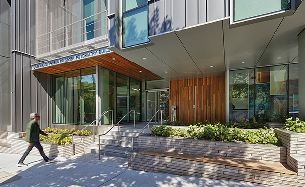
Kimberly Bandy: The most important outcome was to create an outpatient mental health facility that would welcome a range of ages and ensure a calming and respectful environment. The building’s orientation on the sloped site allowed for two separate entrances, with a first-floor adult entrance and a second-story entrance for children and families.
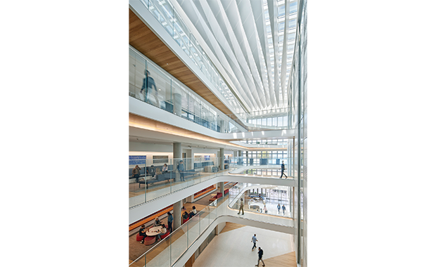
Providing entries of different scale and demeanor allows patients’ arrival sequence to be attuned to what suits them best. While the [adult] entrance is grand and optimistic, it follows a familiar urban condition of a vertical, glassy entrance flanked by a retail space and leading directly into the five-story atrium. The [children’s] entrance aligns itself with the residential scale of the street, where patients approach a vegetated, stoop-like entry into a more receded entry doorway.
Separate floors address the unique needs of the different patients served, as well. The design team employed careful programming to provide a specialized care experience dedicated to specific ages on each floor. The interior for children and teenagers is designed to accommodate families, with groupings of smaller furniture, child-friendly textures, and art created by San Francisco youth.
A lot of thought was put into interdisciplinary engagement, as well. How does the design support the goal of enticing clinicians and faculty members to leave silos and share space?
Bandy: One of the design drivers was to enhance the opportunity for clinicians, researchers, and students to collaborate more readily. This was partly accomplished by collocating some of UCSF’s most impactful research and clinical practices within this one building; a grid of consult/office pods supports overlap of various programs or individualization of those spaces, depending on the program’s needs.
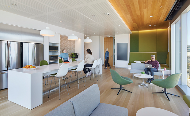
Careful attention was given to strategies that draw researchers and practitioners out of traditional workspaces to promote interdisciplinary engagement, including open workspaces, collaboration spaces, an outdoor terrace, and staff lounges.
Staff lounges that stack on each floor while adjacent to vertical circulation provide direct connection across floors as well as wonderful views of the bay and access to natural light.
The design embraces visibility and transparency. Why was this so important, and what was key to achieving it so thoroughly?
Mirjana Munetic: Research indicates that the stigma associated with behavioral health services, compounded by a scarcity of clinicians and facilities, resulted in more than one-half of those with mental health disorders foregoing treatment. This facility is intended to serve the Bay Area community in breaking that cycle and increasing access for patients across the full spectrum of ages, including some of the most vulnerable patient populations.
Normalizing the care environment meant giving patients access to qualities that comfort and soothe them and designing to create a sense of optimism and hospitality. To that end, openness to the community and transparency in how the building will operate was a primary design driver at UCSF. Both are emphasized through the central atrium and the materials palette.
The five-story atrium is the heart of the building, where one can see multiple floors all at once. It provides a frame of reference for general orientation, organizes the program, and supports the patient experience with wayfinding. This transparency also aids in openness and visibility and increased safety. It is a space that gives a sense of connection while also being a place of refuge and repose.
(For more on Nancy Friend Pritzker Psychiatry Building’s and its new approach to outpatient mental health care, go here.)
Jennifer Kovacs Silvis is editor-in-chief of Healthcare Design. She can be reached at jennifer.silvis@emeraldx.com.


