Crystal Clinic Orthopaedic Center, Ohio: 2023 Design Showcase Award Of Merit
This article was originally published on August 16, 2023, and is among Healthcare Design’s most-read articles of 2023. To see a full list, click here.
Crystal Clinic Orthopaedic Center, Ohio
Crystal Clinic Orthopaedic Center (CCOC) in Akron, Ohio, set out to create a hospitality-driven destination for orthopedic, musculoskeletal, and reconstructive care. Guiding the way was a design mission to create an “oasis of calm” that reimagines the hospital environment through both hotel-like experiences and aesthetics.
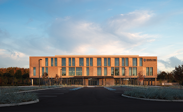
The 165,000-square-foot project, submitted to the Design Showcase by HGA (Milwaukee), leverages numerous connections to nature to blur the lines between inside and out while integrating a materials and finish palette that delivers luxury while still meeting rigorous inpatient design standards.
Completed in November 2021, CCOC not only ups the ante on experience but does so within a highly efficient layout that reduced travel nurse time by 13 percent.
Here, lead designers from HGA Jes Skaug, associate vice president and senior project designer, and Paul Widlarz, vice president and principal, share insight on some of the project’s defining features.
Healthcare Design: The design of Crystal Clinic was driven by the goal of creating an “oasis of calm.” What did that phrase mean for the project team, and how did it shape the initial design?
Paul Widlarz: This was CCOC’s first freestanding hospital project, and one of the primary goals was to create a place, an oasis, where CCOC’s exceptional reputation for advanced clinical care would be provided in a setting that felt more like hospitality than hospital. With an emphasis on creating a superior patient experience, CCOC was designed intentionally to instill a sense of calm for patients and their families.
From the moment a patient enters the site, care was taken to ensure their journey was intuitive and stress free. Wayfinding, supported by clear and thoughtful signage, ample parking close to the main entry, and a welcoming drop-off canopy, makes arrival and entry effortless.
Inside, to create a sense of calm, the design uses a palette that’s soft and quiet, with a focus on soothing neutrals in lieu of busy patterns and graphics. Together, the site, building presentation, interior amenities, world-class medicine, and caregiving coalesce in an oasis of calm for outstanding surgical outcomes and patient experiences.
One challenge to design was the surrounding business park’s deed restrictions. How were you able to design within those parameters and still create a unique and branded experience?
Jes Skaug: The business park’s deed restrictions stated that any new building was required to be configured of rectangular shapes (no curved forms) and had to be clad in “earth-tone masonry” consistent with other buildings in the park. CCOC employed a modern brick blend of warm, soft grays that were brighter and stood out from the predominantly red-toned neighboring buildings. The blend also used a combination of both smooth and textured bricks to create a skin that was dynamic in the way it reflected daylight.
Other buildings in the park are also homogenous in their lack of transparency and openness, fortified with small, punched openings or ribbon windows with heavily tinted glass, with little to no window depth. In contrast, CCOC created a very porous façade where glass and masonry appear to be equal in percentage. Dramatic and deeply inset chamfered windows and the use of clear glass allows visibility into the building from outside, making the building more inviting and less intimidating.
How did the program itself—and the desire to become a national destination for care—inspire the hospitality-focused design?
Widlarz: The services CCOC provides are elective, so the group knew that differentiating itself in the market was the best way to attract patients who have a choice in their location for surgery. The owner requested that the building and environment not look or feel like a hospital and really wanted to provide patients with an elevated and unique experience that couldn’t be found elsewhere in the community.
In contrast to its competitors, CCOC took a nonclinical, or nonhealthcare, approach and rooted its aesthetic in hospitality and respite, creating a patient experience that focuses on visual calmness and connectedness to nature.
Due to the relatively low acuity of the patients, the program lent itself to design solutions that are less confining than those that support critical care. The typical two-day stay feels more like a rejuvenating time away at a boutique hotel rather than a hospital.
What are some key hospitality principles adopted in the project, and ways the design supports them?
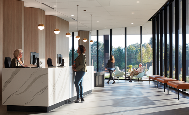
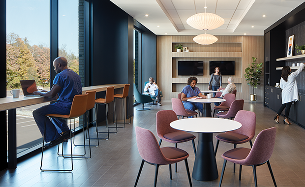
Skaug: In early design discussions with the owner, it became clear that a main differentiator would be to create an environment where family members of patients had choice in where they wait. The lobby, dining room, café, and lounge seating areas are really the continuation of one space and support family finding a spot that’s most comfortable for them.
Interior seating and dining areas are directly adjacent to exterior gardens, and there is an exterior balcony connected to the surgical lounge on Level 2. This embraced landscape is an extension of the interior experience and was a key principle to creating the hospitality vision.
Additionally, hospitality-like concierge and check-in desks immediately greet patients and visitors upon entry. Unlike typical hospitals where rows of open seating dominate the space, waiting at CCOC is intimate and screened by a sculptural wood wall that is the backdrop to the reception desks, affording patient spaces privacy and not allowing seating to overshadow the first impression upon entry.
What are some of the notable design solutions that helped ensure better operational efficiency, as well?
Widlarz: CCOC placed a great emphasis on Lean operations. So much so that they dedicated several months to Lean process improvement exercises with hospital service line leaders, led by Vizient with the participation and engagement of designers and planners from HGA.
Outcomes of this collaborative process included a hyper-efficient inpatient platform that reduced nurse travel distances by more than 13 percent from a typical racetrack unit design. This was accomplished through the thoughtful planning of patient rooms into 10-bed neighborhoods on a single floor plate that accommodated 60 total inpatient rooms.
Each neighborhood not only ensures optimal visual connections for nurses into patient rooms but also streamlines their access to supplies and support spaces to allow for more time spent at the bedside. The 60-bed platform also allows for the flexing of beds and staffing to meet day-to-day and shift-to-shift census while reducing the inefficiency of staffing to minimum levels across multiple floors.
Similarly, the surgical platform placed all components of the 12-operating-room surgical service line on a single floor, optimally placed to ensure a smooth and seamless process of movement for patients, staff, surgeons, and materials.
Jennifer Kovacs Silvis is editor-in-chief of Healthcare Design. She can be reached at jennifer.silvis@emeraldx.com.


